GoMaster KON MOMO R2
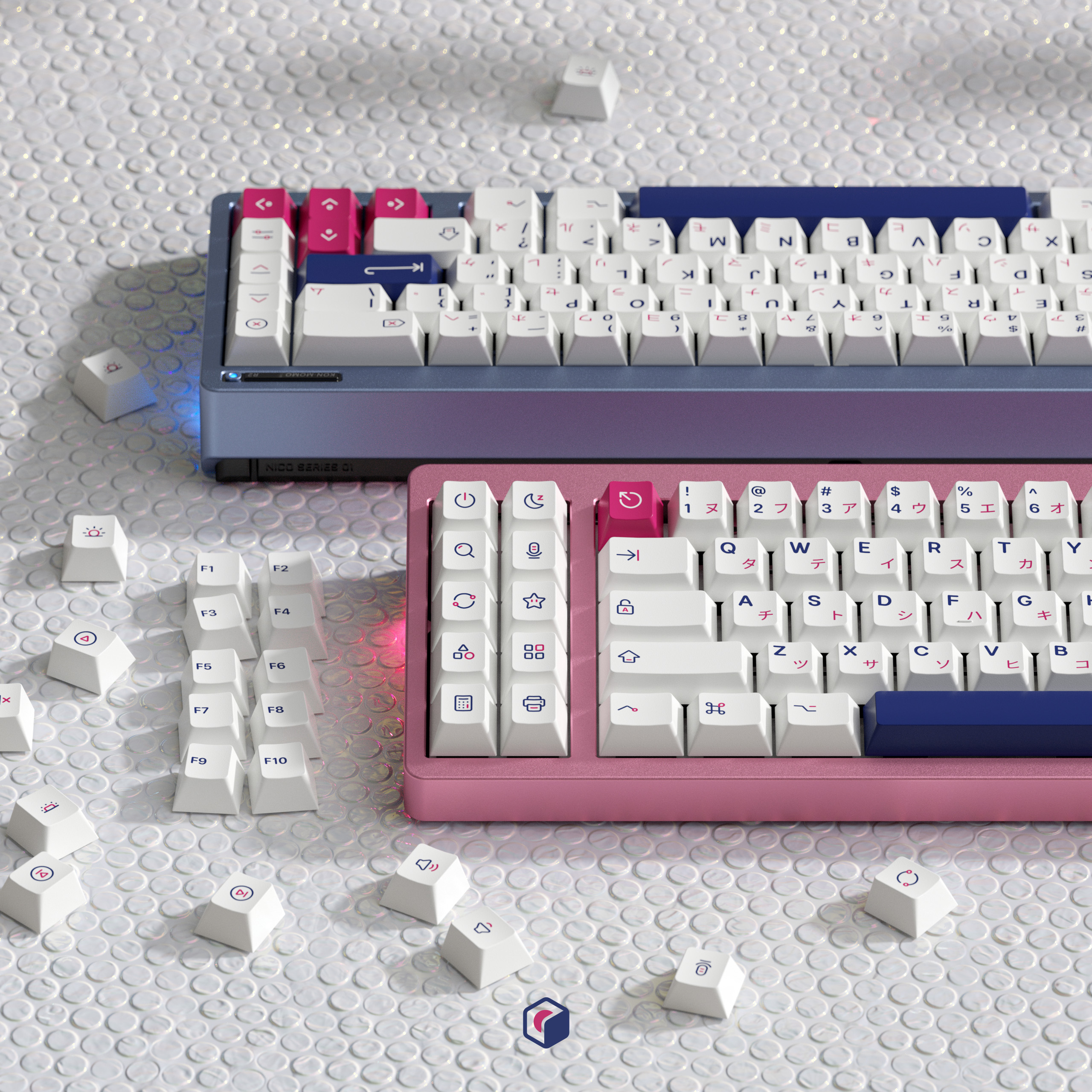
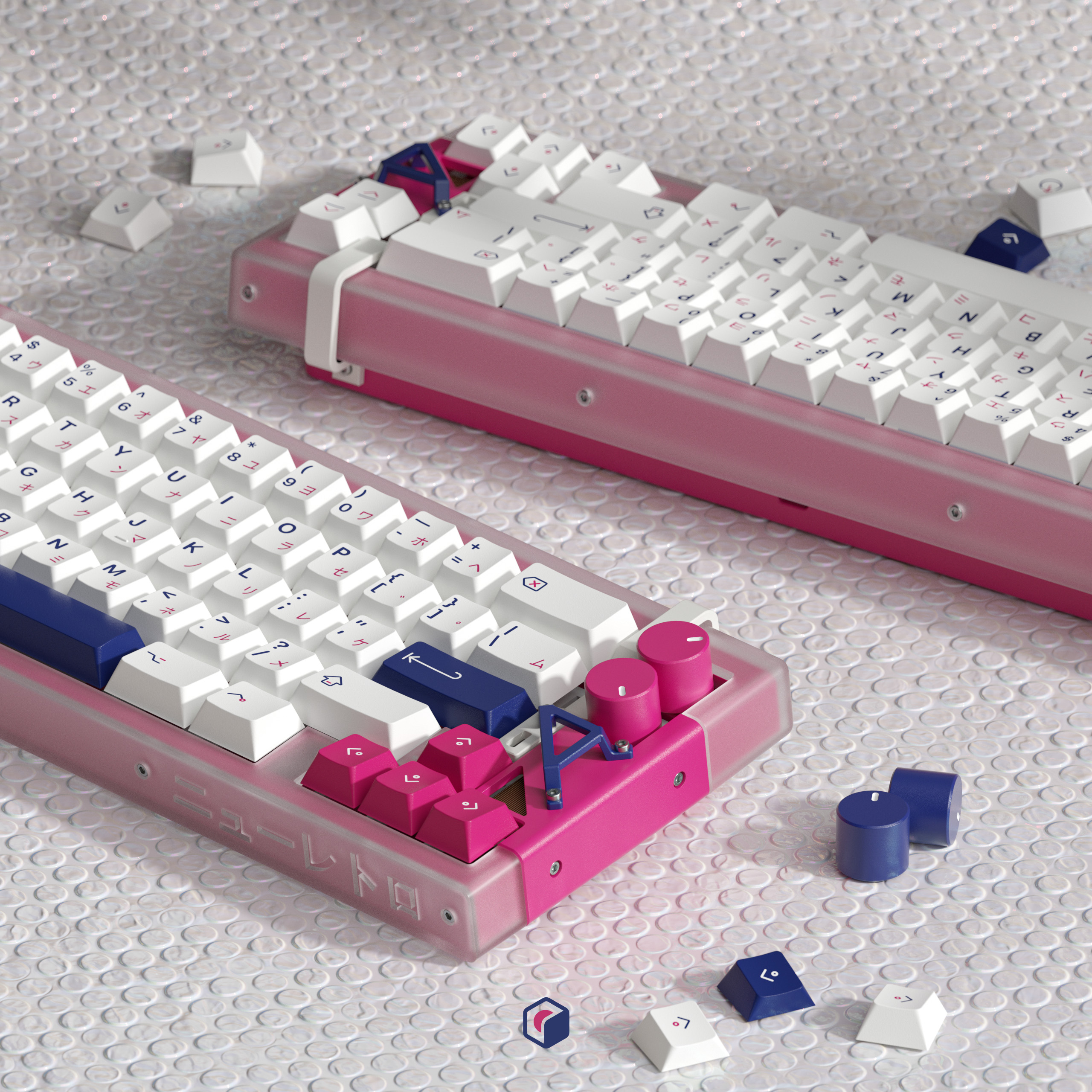
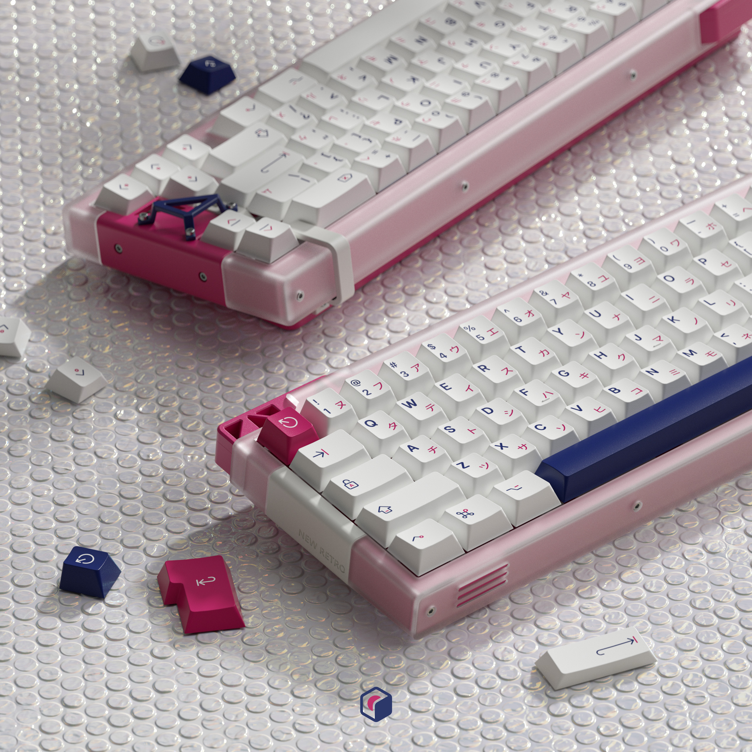
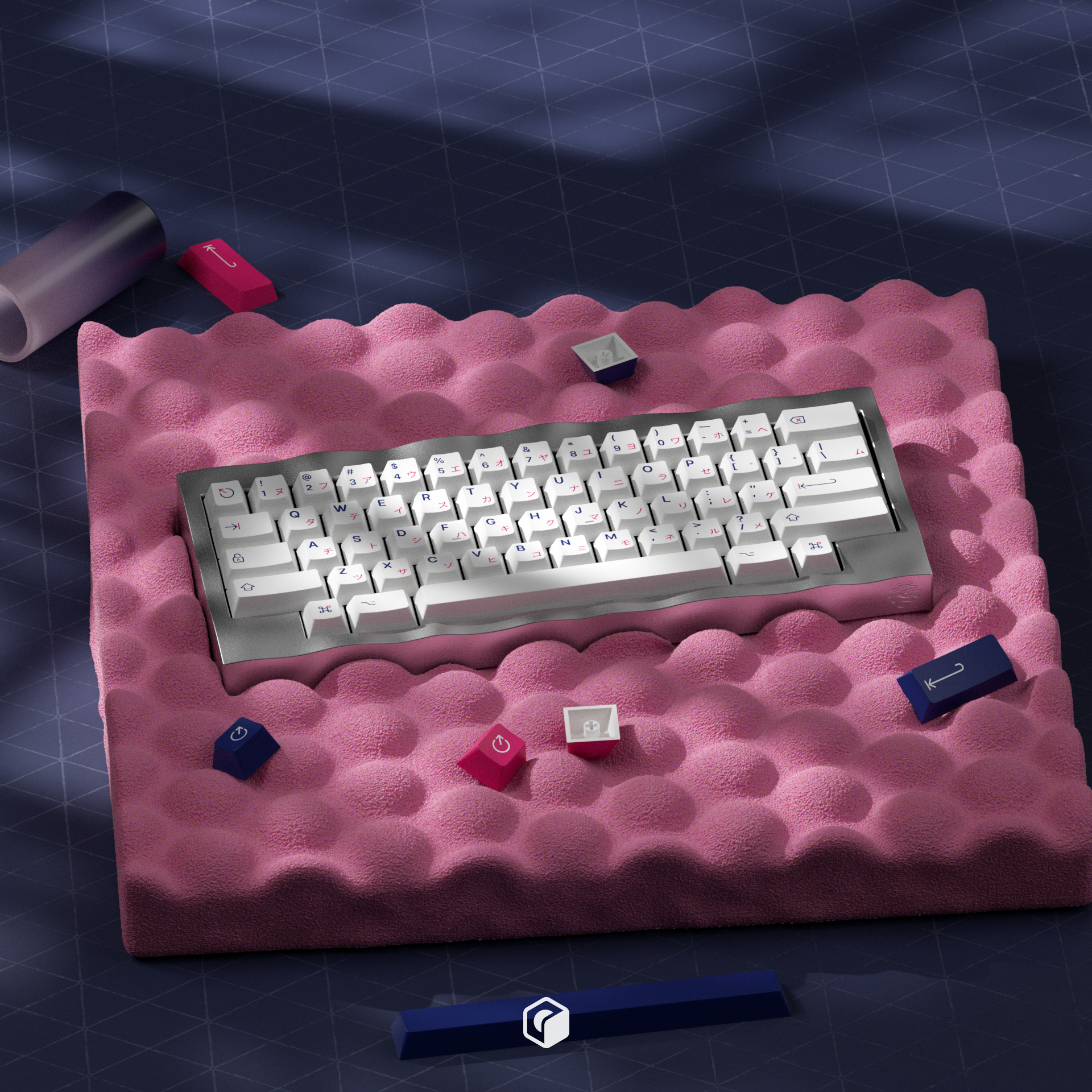
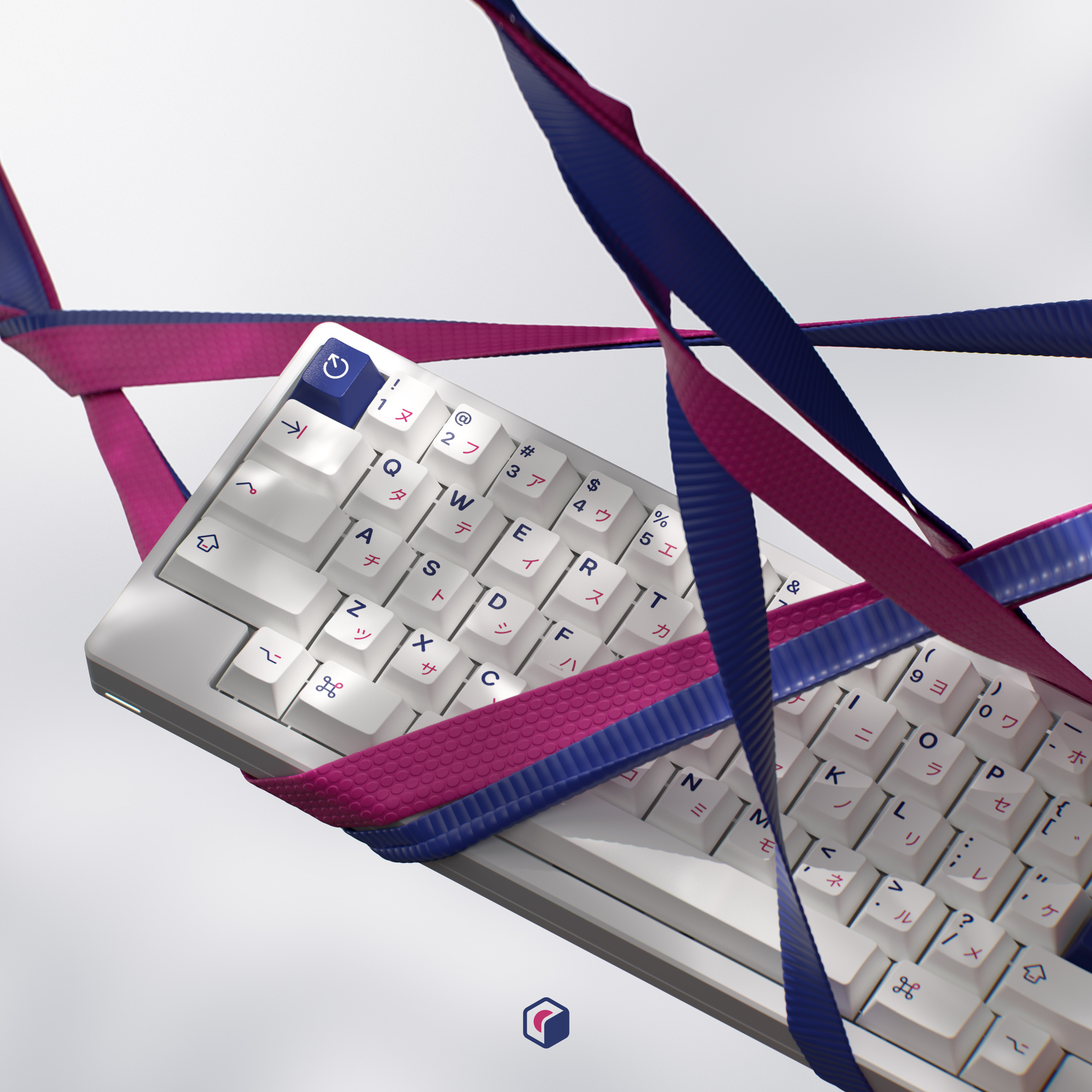
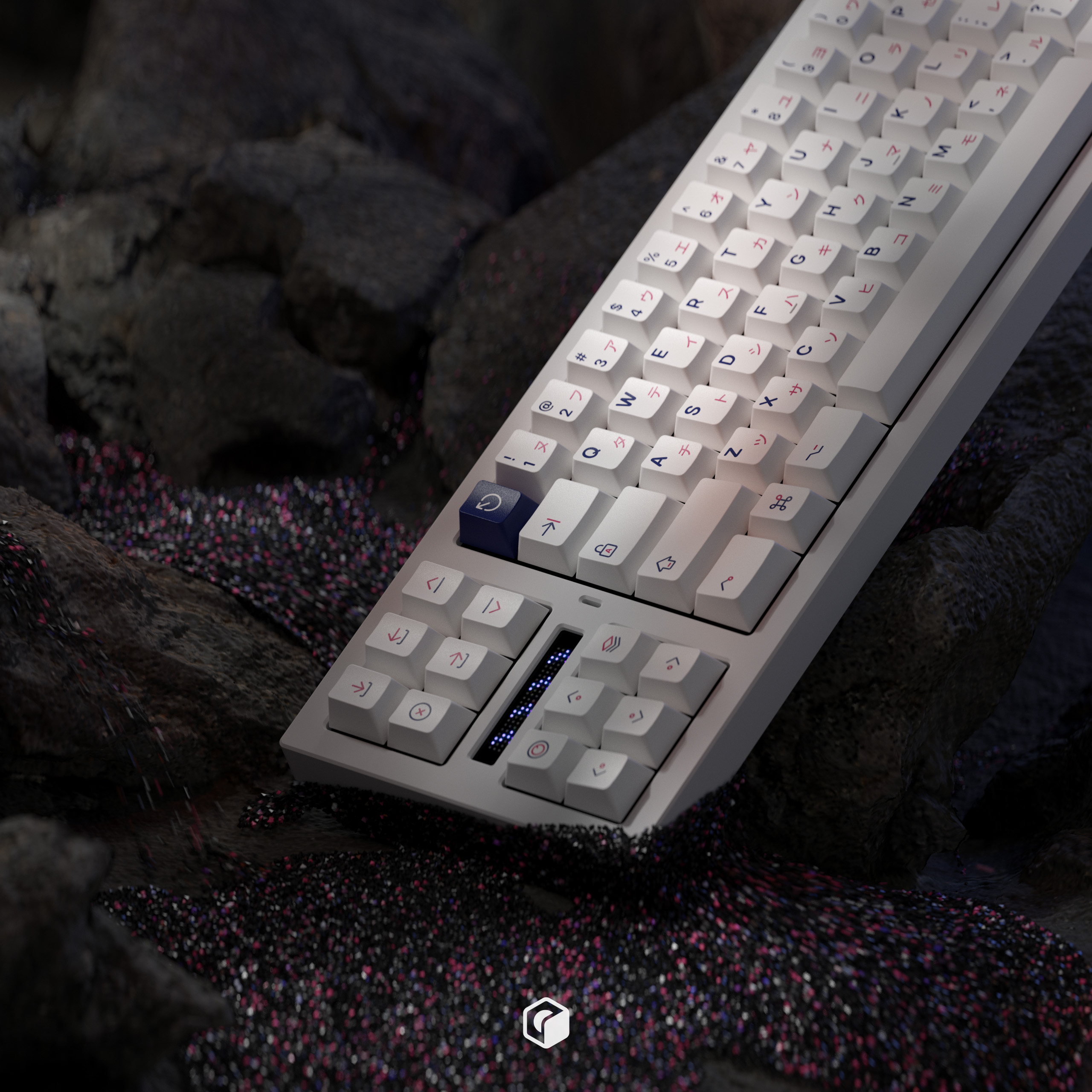
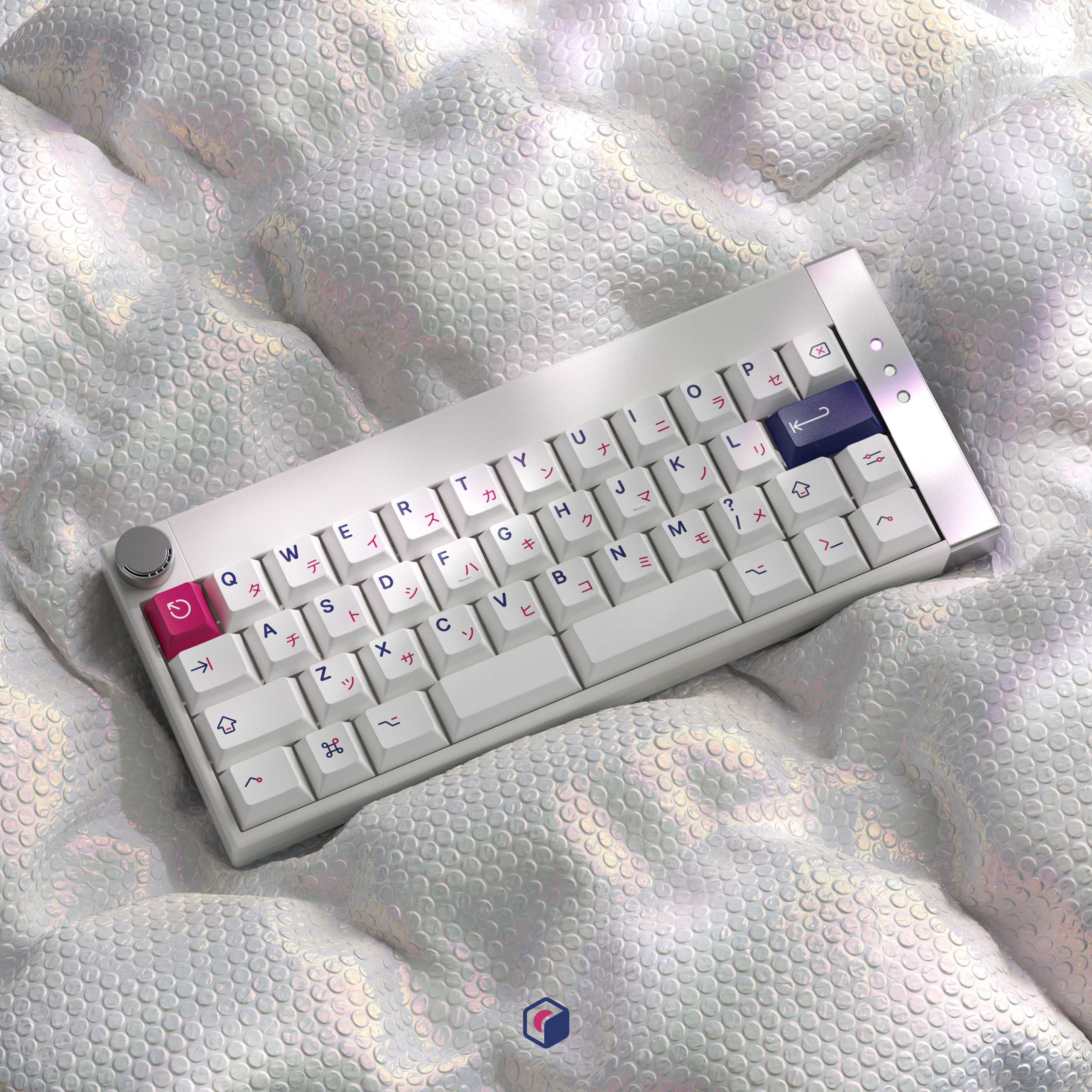
Hello everyone, I am York Chan from Material Lab. This time, I am bringing back the classic design 紺桃KON MOMO to you. The inspiration comes from the combination of rounded symbols and the MacOS layout, blending two high-contrast colors, peach pink and navy blue, as the base tones. What’s more, the traditional katakana layout has been simplified. Compared to R1, we redesigned most symbols for a more unified visual appearance. Most importantly, we slightly adjust the colors and use Apple’s commonly well-known white as our main tone.
Kittings
Temporary hidden
